SWITZER ON MAIN
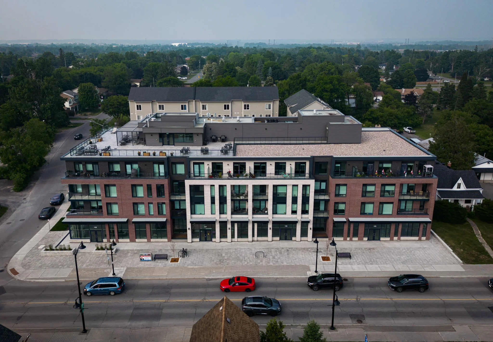
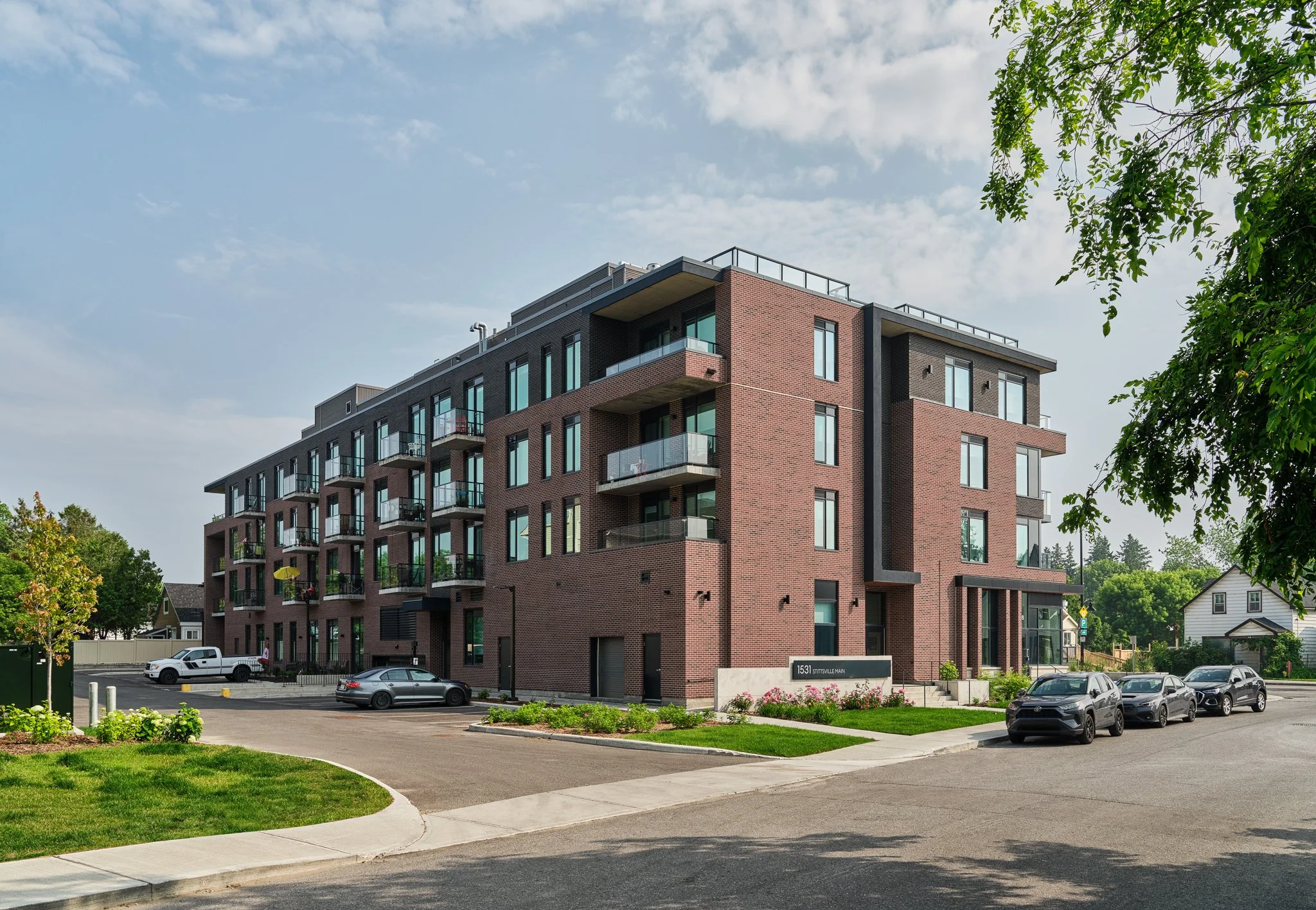
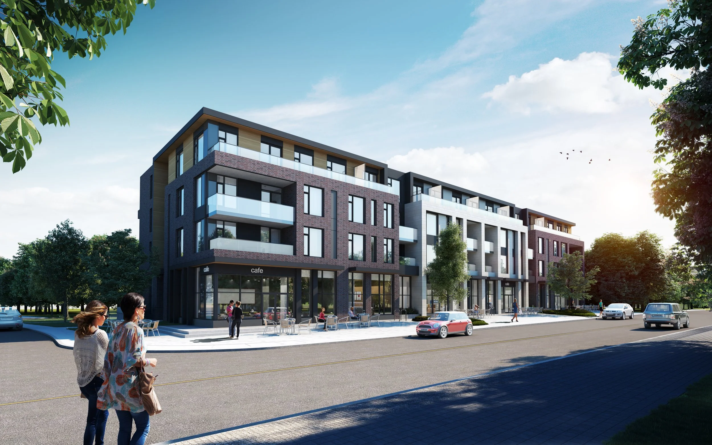
The site occupies a lengthy frontage along Stittsville Main Street, so the first challenge was creating a massing for the building that responded to the character of the existing small buildings while meeting the intensification expected for the site. The design solution was to design the building as a series of three separate volumes that are linked together by recessed elements in order to create a building that appears to be three buildings fused together instead of one long structure.
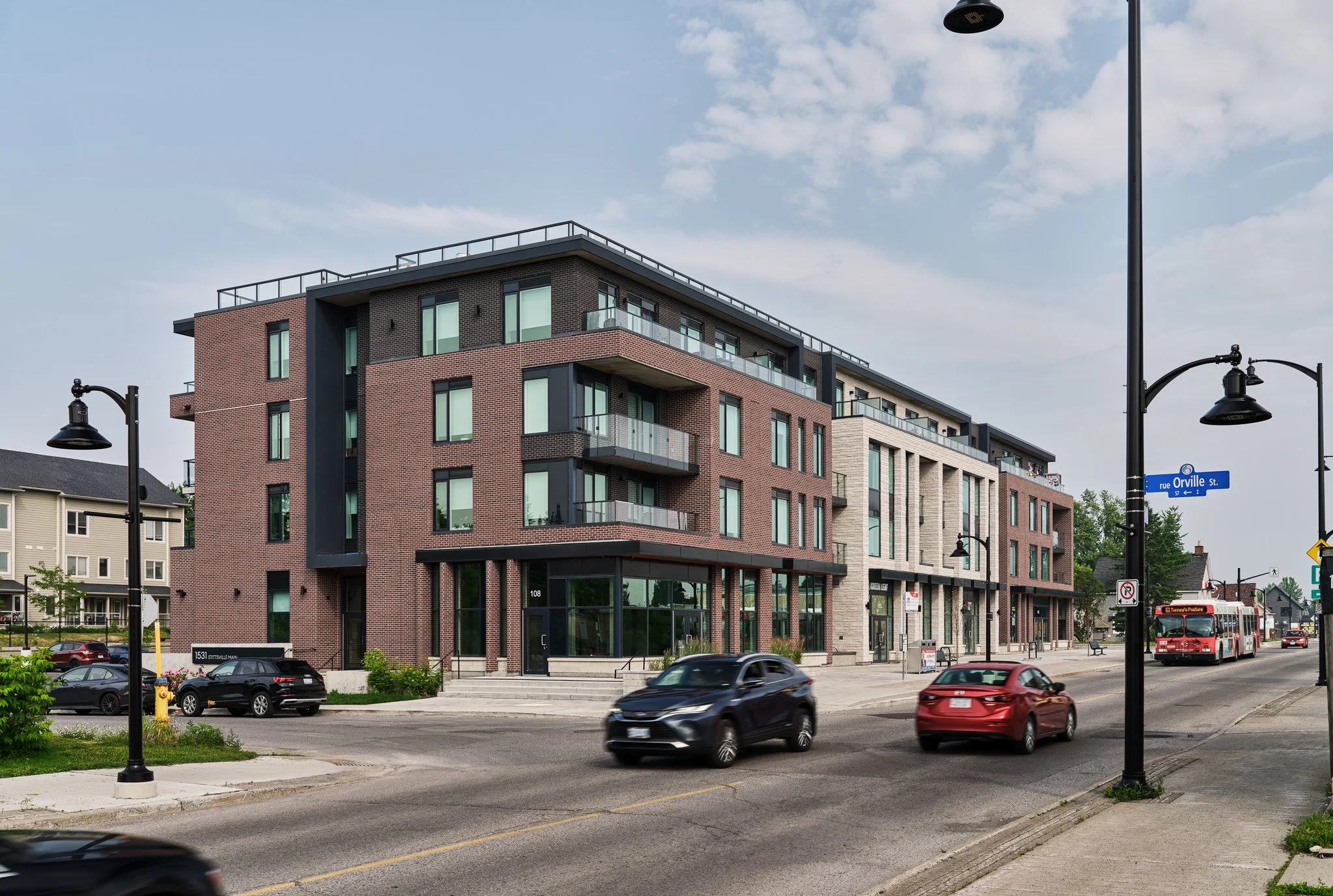
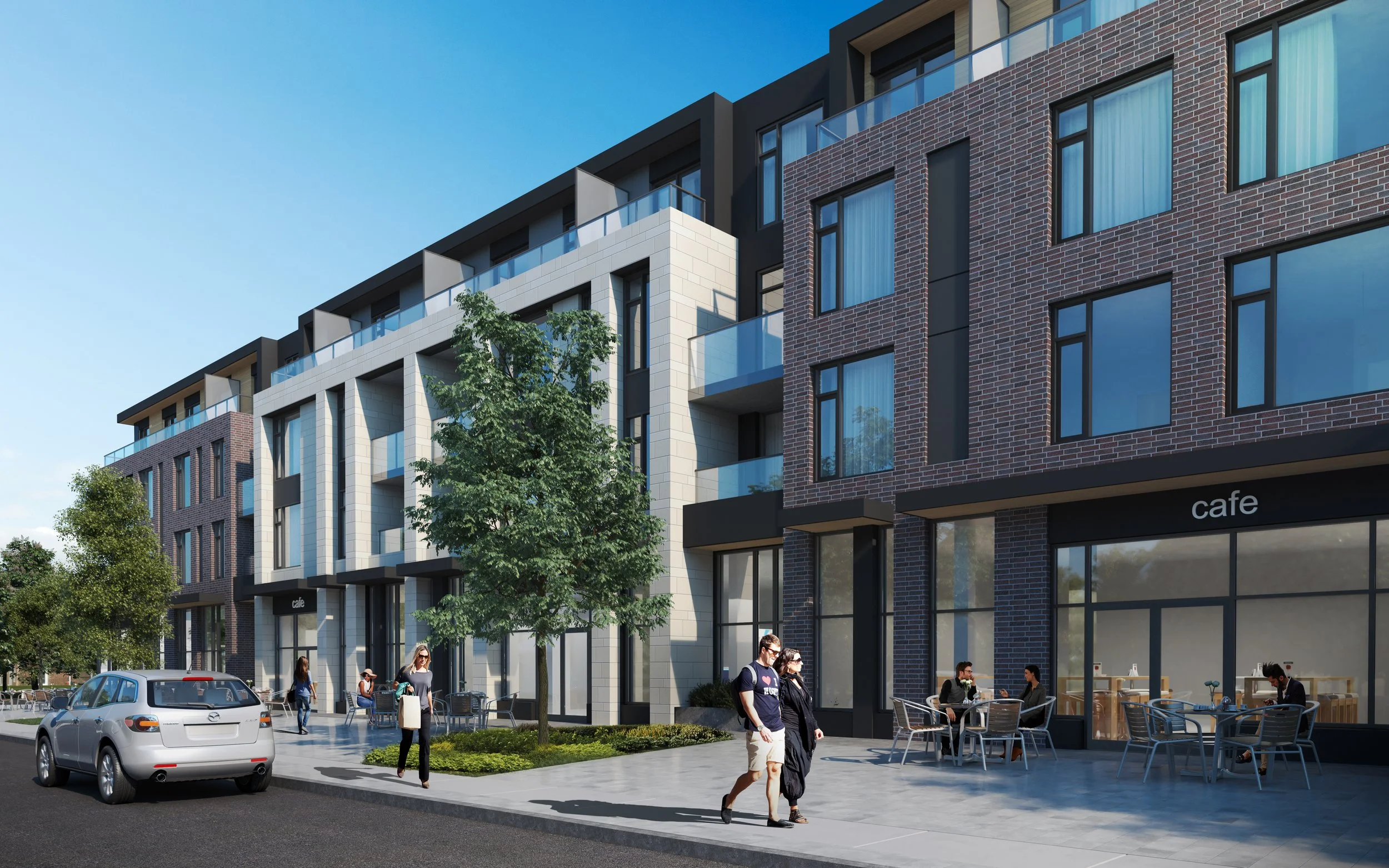
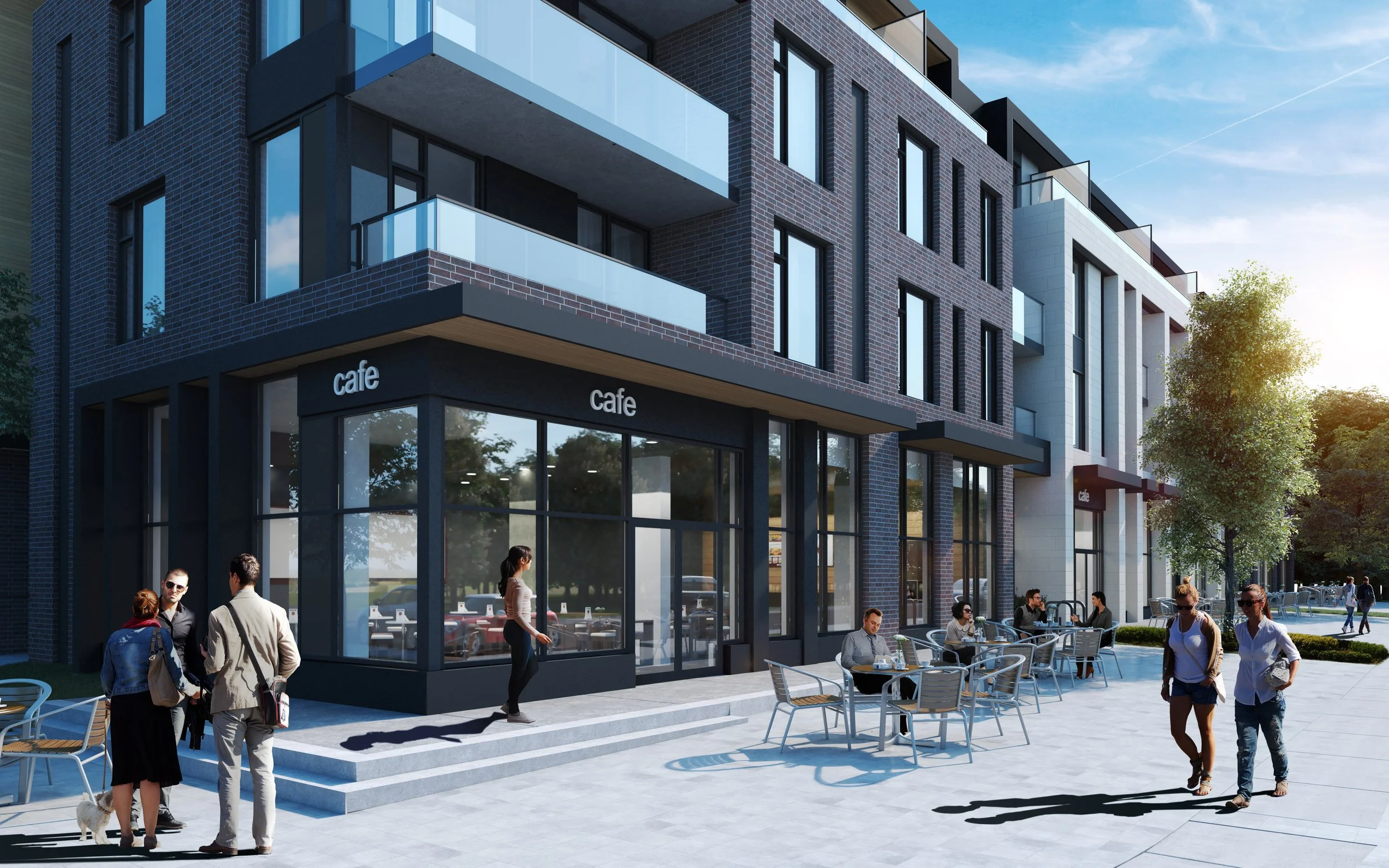
At the street level the building has been designed to heighten the pedestrian experience. Storefronts are tall and mainly glazed, there are staggered and varied canopies that add character to the building and shield pedestrians from the elements. There are a number of architectural details, from piers to signage that serve to reduce the impact of the building and enhance the human scale of the project. The landscape has been designed to allow each of the retail spaces to spill out and offer generous patio spaces. At the upper level of the building a series of high canopies match the proportion of the volumes below and are effective in creating a rhythm with the upper level mass.
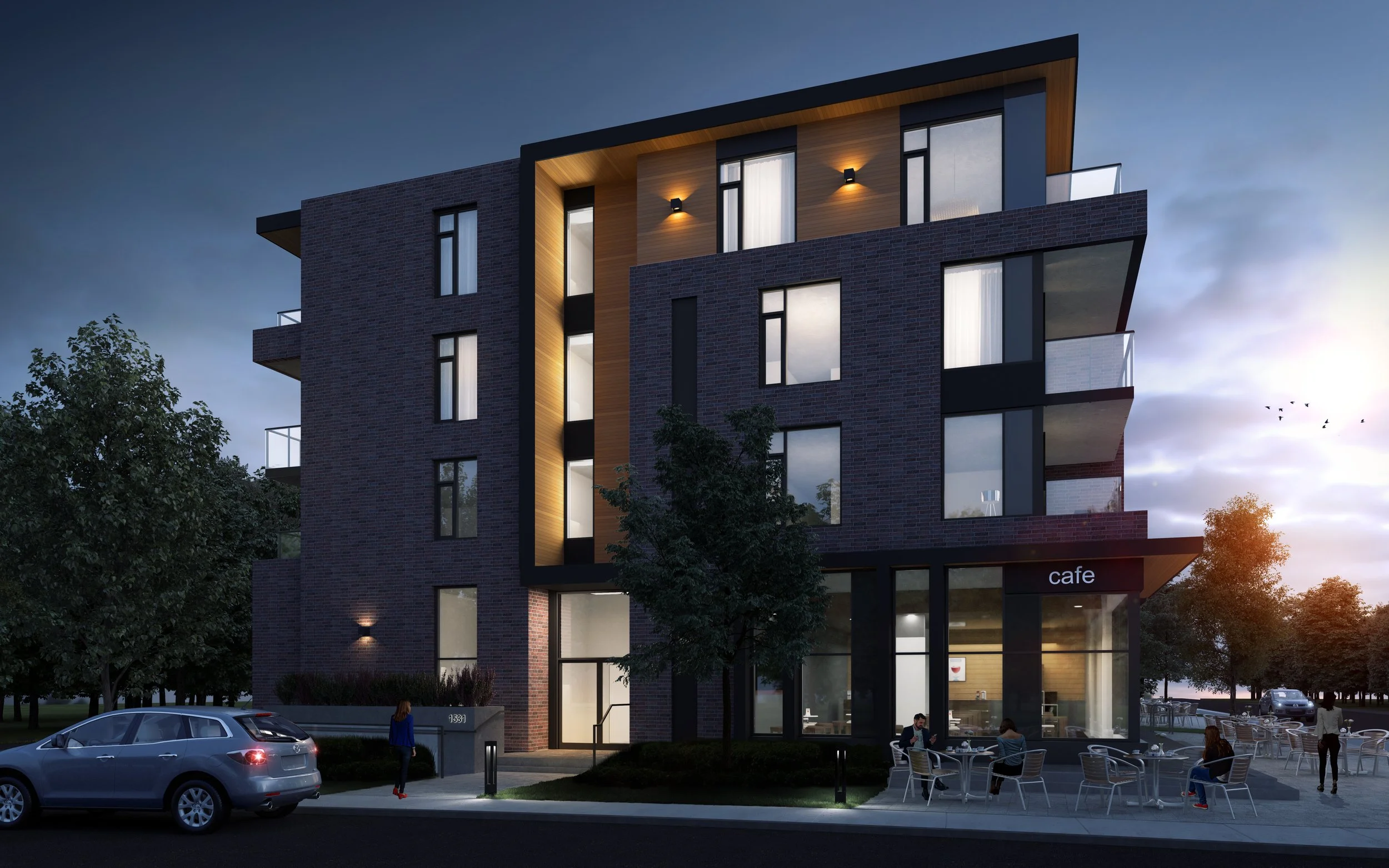
The building has been designed to engage pedestrians and to be active at the street level. At the street corner the building is expressive, but it also respects the typical cadence and rhythm of walkable streets and blocks. While it uses a contemporary architectural language, this project has been carefully designed to be timeless.


